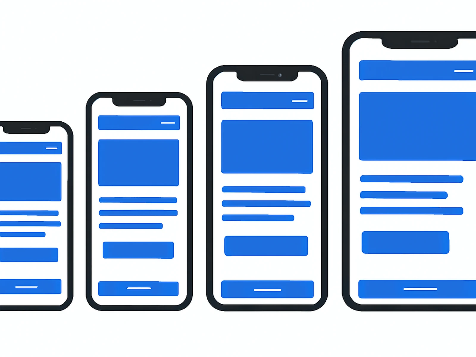
Mobile-first design is not a feature. It is a methodology that determines how design decisions are made from the beginning of a project. When we say mobile-first, we mean the small-screen experience is designed and validated before we consider how it adapts to larger screens, not the other way around.
This matters for most businesses operating in Spain and Andalusia. Mobile search traffic consistently exceeds desktop in the sectors we work with. A site that looks good on a MacBook but requires pinching and zooming on an iPhone is losing customers at the first point of contact.
Mobile-first design also correlates strongly with search performance. Google indexes the mobile version of your site. A well-built mobile experience is not just about user experience; it directly affects where your business appears in search results.
WHAT IS INCLUDED
DELIVERY
4 to 6 weeks. Digital delivery.